Professional English: Writing: UNIT 4
Transcoding
Writing | Professional English
We shall study the illustration of text with figures and graphs. Visual representation is an added advantage to presentation. Figures may be further classified into graphs, maps, charts and diagrams.
CHAPTER - 9
TRANSCODING
Transfer
of the information from verbal to nonverbal or vice versa is an essential
learning skill of professional study. Transcoding is one of the significant
features of professional writing. We shall study the illustration of text with
figures and graphs. Visual representation is an added advantage to
presentation. Figures may be further classified into graphs, maps, charts and
diagrams.
Engineers
and technocrats are often required to prepare charts and diagrams. The bar
chart/graphs makes its particularly easy to compare data.
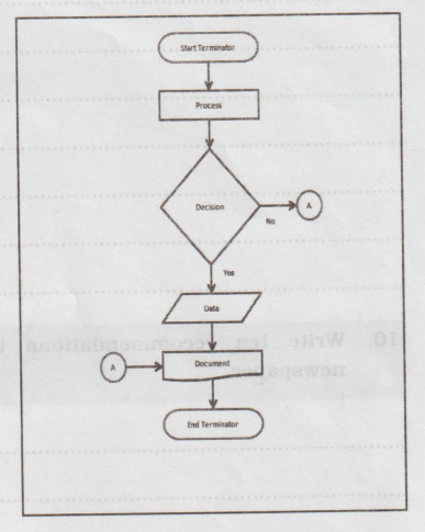
I. Flow chart
A
flowchart is a type of diagram that represents a workflow or process. A
flowchart can also be defined as a diagrammatic representation of an algorithm,
a step-by-step approach to solving a task. The flowchart shows the steps as
boxes of various kinds, and their order by connecting the boxes with arrows.
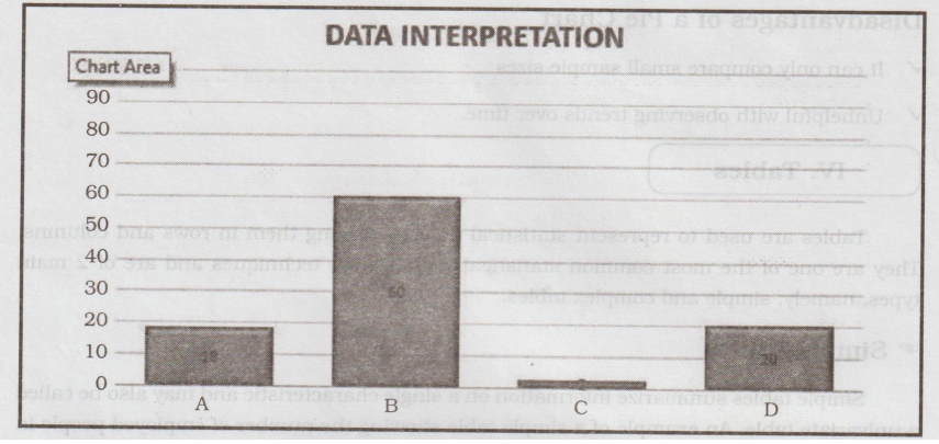
II. Bar Graphs
Bar
graphs are graphs that interpret the relationship between 2 or more variables
using rectangular bars. These rectangular bars can be drawn either vertically
or horizontally, but they are mostly drawn vertically.
The
graph contains the horizontal axis (x) and the vertical axis (y), with the
former representing the independent variable while the latter is the dependent
variable.
Advantages of a Bar Graph
✓ It helps to summarize a large data
✓ Estimations of key values can be made at a glance
✓ Can be easily understood
Disadvantages of a Bar Graph
✓It may require additional explanation.
✓ It can be easily manipulated.
✓ It doesn't properly describe the dataset.
III. Pie Chart
A
pie chart is a circular graph used to repre- sent the percentage of occurrence
of a variable using sectors. The size of each sector is depen- dent on the
frequency or percentage of the cor-li responding variables.
Advantages of a Pie Chart
✓ It is visually appealing.
✓ Best for comparing small data samples.
Disadvantages of a Pie Chart
✓ It can only compare small sample sizes.
✓ Unhelpful with observing trends over time.
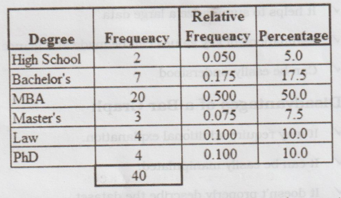
IV. Tables
Tables
are used to represent statistical data by placing them in rows and columns.
They are one of the most common statistical visualization techniques and are of
2 main types, namely; simple and complex tables.
Simple Tables
Simple
tables summarize information on a single characteristic and may also be called
a univariate table. An example of a simple table showing the number of employed
people in a community concerning their age group.
Complex Tables
As
its name suggests, complex tables summarize complex information and present
them in two or more intersecting categories. A complex table example is a table
showing the number of employed people in a population concerning their age
group and sex as shown in the table below.
Advantages of Tables
✓Can contain large data sets
✓ Helpful in comparing 2 or more similar things
Disadvantages of Tables
✓ They do not give detailed information.
✓ Maybe time-consuming.
V. Line Graph
Line
graphs or charts are a type of graph that displays information as a series of
points, usually connected by a straight line. Some of the types of line graphs
are highlighted below.
Simple Line Graphs
Simple
line graphs show the trend of data over time, and may also be used to compare
categories. Let us assume we got the sales data of a firm for each quarter and
are to visualize it using a line graph to estimate sales for the next year.
Line Graphs with Markers
These
are similar to line graphs but have visible markers illustrating the data
points
Stacked Line Graphs
Stacked
line graphs are line graphs where the points do not overlap, and the graphs are
therefore placed on top of each other. Consider that we got the quarterly sales
data for each product sold by the company and are to visualize it to predict
company sales for the next year.
Advantages of a Line Graph
✓ Great for visualizing trends and changes over time.
✓It is simple to construct and read.
Disadvantage of a Line Graph
✓ It can not compare different variables at a single
place or time.
Examples
I.
Study the chart given below, which is the result of the survey conducted in the
public schools and government schools of Vadodara. This depicts the types of
activities the teenagers (Age 13- 19 years are involved during their leisure
time). Complete the summary in about 80 words.
Answer:
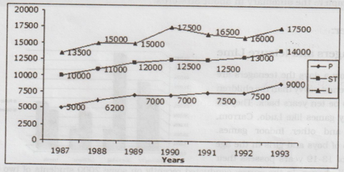
Teenagers
and leisure Lime
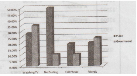
Now
a days the teenagers are more techno-savvy than the children used to be ten
years back. They do not play games like Ludo, Carrom, Chess and other indoor
games. 9-18 % of boys and girls in the age group of 13-19 years possess their own
cell phones. In the survey conducted recently on some 2000 students of two
leading schools- one government and the other a public school, the following
facts were revealed. While the students from public schools spend more of their
leisure time in net-surfing and talking on cell phones, the government school
students spend it in watching TV and talking to their friends.
2.
Summarise the information by selecting and reporting the main features, and
make comparisons where relevant.
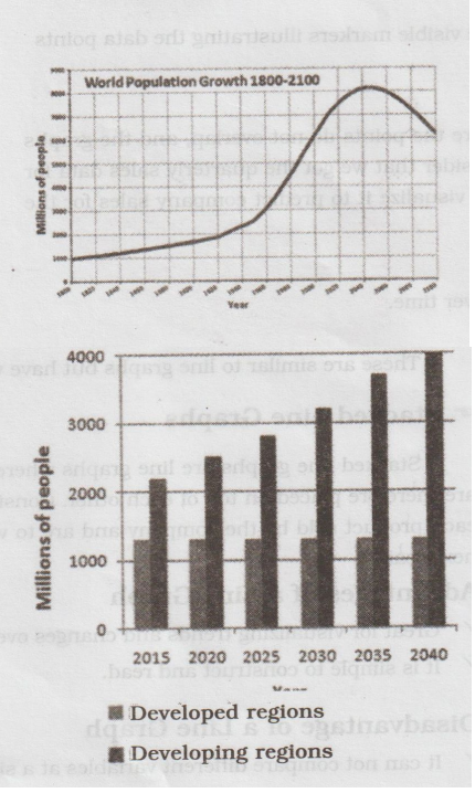
Answer:
The
first graph shows the trend in world population growth between 1800 and 2100,
while the second graph gives predicted urban population figures for the next 25
years. The world population has experienced continuous growth since 1800.
Between 1800 and 1950, the population grew slowly from just under 1 billion to
2.5 billion people. After that, the growth rate increased, and currently, the
figure is around 6.5 billion. Projections show a continued increase in
population in the near future, but a steady decline in the population growth
rate.
The
global population is expected to peak at 8.2 billion by 2050, and then decline
to around 6.2 billion by 2100. The predictions also show that almost all urban
population growth in the next 25 years will occur in the cities of developing
countries. In the developed regions, on the other hand, the urban population is
expected to remain unchanged at about 1.3 billion people over the next two
decades. The graphs show that the global population increase will not occur
evenly throughout the world, but will be greater in some areas than others.
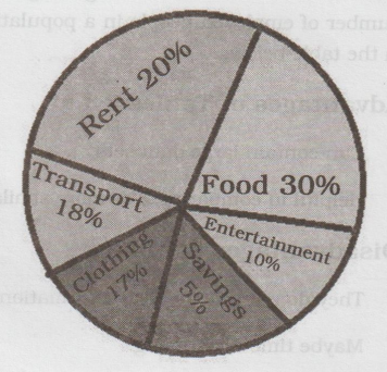
3.
The given pie chart depicts/shows/ represents the family monthly budget of
Mr.John.
Answer:
Pie
Chart
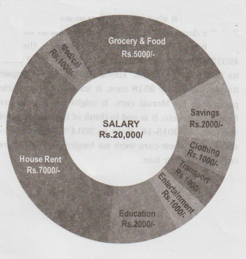
Mr.
John's salary is rupees 20,000, he spends 5,000 rupees for grocery and food. He
spends rupees 1,000 for medical, his house rent works out to 7,000 rupees
including electricity. Mr. John allots rupees 2,000 for education apart from
donations. His expenditure for transport is rupees 1,000. The amount spent for
clothing is rupees 1,000
Comments;
Mr. John is spending his money carefully, he can plan and save more money.
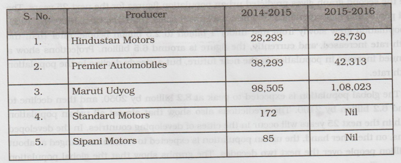
4. Convert the data given in tabular column to a paragraph on the production of passenger cars in India in 2014-15 and 2015-2016
Answer:
This
table depicts details about the production of passenger cars in India, in
2014-15 & 2015-16 by Hindustan motors, Premier automobiles, Maruti Udyog,
Standard Motors and Sipani Motors. The table shows the variation in the
production of passenger cars, with Maruti Udyog ranking first whereas Standard
motors and Sipani Motors stopping their production altogether in 2015-16. The
production of passenger cars by Hindustan Motors was 28293 in 2014-15 and it
shot up to 28730 in 2015-16 showing an increase of 437 cars. This shows that
the demand for their cars increased in 2015-16. Similarly, there was increase
in the production of cars by Premier Automobiles, their manufacturing figures
being 38293 and 42313 respectively, with an increase of 4020 cars. Maruti Udyog
excelled them all with its figures in six digits, 108023 in 2015-16 compared
with 98505 in 2014-15, increasing its production by 9518 cars. It indicates
that during that period people had the greatest preference for Maruti cars. It
might me due to price, Fuel economy, Size, Maintenance, Resale value, etc. It
is sad to think of Standard Motors and Sipani Motors whose production was 'NIL'
in 2015-16. Even in 2014-15 their production was the lowest (172 and 85). It
shows that their cars were no longer popular. Moreover the growing popularity
of Maruti cars sealed their fate.
5.
Convert the following paragraph into a flowchart on the process of making
cheese:
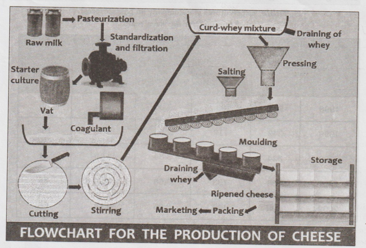
Answer:
There
are different varieties of cheese and different procedures to follow. But the
basic process to make ordinary cheese is same. It includes a few steps. The
following passage gives a quick overview of the process.
Before
the milk is turned into cheese, the milk has to be processed. It has to be made
more acidic and so it has to be fermented. Adding rennet causes a reaction that
changes milk into curd. Next, the cheese maker cuts the curd with knives and
heats it. The curd is separated into curd and whey. The curd is dried and
acidified through processing like stirring, cooking and washing. And then whey
is drained, leaving only a mat of cheese curds. The cheese maker next cuts the
mat into sections and repeatedly flips the sections before milling the mat.
Salt is added in some cheeses and for others, brining is done. The cheese is
cut into different shapes using different molds. Finally cheese is preserved
and packed to be sent for sale.
Professional English: Writing: UNIT 4 : Tag: : Writing | Professional English - Transcoding
Related Topics
Related Subjects
Professional English II
HS3251 2nd Semester 2021 Regulation | 2nd Semester Common to all Dept 2021 Regulation